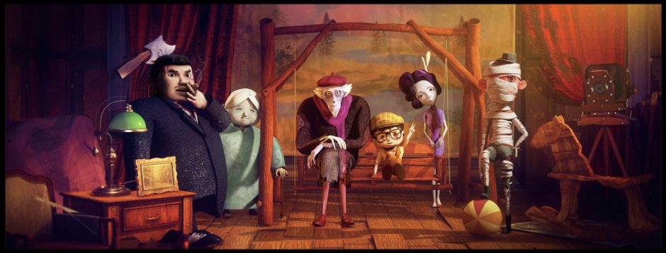
FMP and Thesis Proposal

Investigation and Practice on the Form and Content of Irony Animation

  • Thesis – Investigation
  • Final Major Project – Practice

Final Major Project

Aims

Based on the three semester keying animation practice and the cognition of film language, I want to complete a short narrative animation combining the two. Generally speaking, the previous animation exercises are fragment type, the purpose of which is to training animation skills and principles, without special plot or thought expression. Therefore in my final project, I hope I can create a connotative animation, which can express my thoughts and feelings on some social situations with storytelling, logicality and creativity. I hope my animation can arouse others’ reflection and thinking, which is my goal of creating animation. I will be willing to show my views and perception in an exaggerated and ironic way of animation.

Rationale

Considering that my FMP project is the summary of my personal learning situation and the embodiment of my professional ability, when considering what type of project to do, my approach is to first consider what I am good at and what I want to show. I know that the fields I like and am good at are model creation and keying animation, that is to say, I hope to be engaged in animation related career in the future, so I choose to do an irony narrative animation. At the same time, I wish to fully show my pre-production and post capability, focusing on the ability to tell stories and reveal the truth, as well as the 3d skills to create character and scenes, as well as rigging and keying animation.

Content

The narrative animation I want to do this time is more accurately irony animation, that is to show some cruel or unbearable reality through animation works. There’s no doubt that our society is plagued with problems like dependence on technology, taxes, obesity, devaluation of workers etc. But that is not the real threat. The real threat is the fact that we refuse to acknowledge these problems to justify our addiction to them. The plot of my animation this time is that a person addicted to computer games becomes the raw material of the food he eats by constantly eating. It’s a simple story that takes place in a room, the process of which is very similar to a cycle. I call it a new way of feeding, that is, “we become what we eat.”

Methodology

In depth analysis of other irony animation features and narrative style, and then complete the storyboard and layout. Then I will create a character and a scene independently, including mapping and rigging, and finally lighting and rendering. I will focus on strengthening my ability in character creation and rigging, combined with my internship learning and some tutorials. What I want to show is exaggeration and atmosphere brought by the picture, and the character’s animation will not be many and complex. I will do more preparation work in the shape of the character, including the details of the scene, because compared with some fighting animation, irony animation needs a lot of obscure but reasonable elements. It will be an animation that allow the audience to watch repeatedly without feeling boring, and the details will be pondered and arranged.

Personal and career development

My project will be carried out simultaneously with my internship in China, because the content of the internship is the in-depth study of creating character model and rigging. I hope that through this training, the model in my personal project can reach a higher level, so as to better show my good field in the animation industry. My challenge is how to use the film language and narrative structure to present the phenomenon I want to expose in an exaggerated way of 3d animation.

Reference

Animations

  1. The village
  2. The employment
  3. Life Smartphone
  4. Dinner for few

Thesis

Relevance (Fmp)

My thesis is actually closely related to my FMP, because the concept of irony animation is a strange word to me. In fact, it’s my first time to try this kind of animation, and it’s related to my internship content, And I hope to gain work experience through this work in the future, so I hope my preparation is very sufficient. So I chose my thesis form to do investigation on my FMP project, that is my FMP is for post-production work, then my pre-production work including research, understanding irony animation style, narrative features, film language, color, sound and other aspects will be totally shown in my thesis paper.

In this process , I will need to understand what ironic animation is, ironic forms and characteristics. Learn about the cases of Disney and Pixar Animation, pull and analyze the details of my favorite irony animation, and collect more irony illustration. On this basis, I will combine my ability and experience, and integrate it into 3D animation. At the same time, I will mention in my paper how I put these theoretical contents into practice in my own works, because most of the irony animations I search for are 2d style, and my goal is to realize the irony of content and form on the basis of 3d technology.

In the process of applying theory to practice, I will record and compare the advantages and disadvantages in each module, such as role setting or shot selection. Besides, I will write my own challenges and difficulties and how to solve them in my thesis paper, so it is more like a record and feedback of my FMP, a reflection of learning and harvest.

Word: 936

Resources:

Posted in Thesis | Leave a comment

Week8 Personal Project 2 — Narrative Animation Project (4)

Outline

  • Scene Model 1
  • Scene Material 1
  • Lighting 1

Part1 Scene Model

Cartoon style room is characterized by its model scale can not be too real, in other words, to make a lot of furniture merge furnishings look very cute, then the size gap between the various objects will not be large, the object is relatively simple and smooth.

The layout of the whole room

Part2 Scene Material

Because this time the character model is more cartoon oriented, so my scene also wants to be cartoon as much as possible, which means that my mapping can’t be too realistic, so I have to draw a lot of maps myself.

Part3 Lighting

The reason why I make this French window is that I think if I use a spotlight to shine into the room, the shape of the window will hit the floor on the bed, which is very atmospheric. So I added a spotlight as the main light source, and then used a face lamp to illuminate the room.

Outside the window, I used a luminous material to create an afternoon evening atmosphere

Rendering

Posted in Advanced & Experimental 3D Computer Animation Techniques | Leave a comment

Portfolio (2020-2021)

Works in UAL (Term1-Term4)

Posted in Portfolio | Leave a comment

Week7 Personal Project 2 — Narrative Animation Project (3)

Outline

  • Character Model
  • Character Material
  • Conclusion

Part1 Character Model

In fact, the age of this character is relatively small, so in the process of creating the model, I want to make the proportion of his head, hands and feet larger, which will make the character look more lovely. His proportion is 2-3 head body, the whole body should give people the feeling of a round, because the round gives people a friendly, tender and lovely feeling.

After finishing the first version, I increased the proportion of his head, enlarged the size of his hands, feet and eyes, lengthened his coat and shortened the proportion of his trousers. This exaggerated proportion is more in line with the characteristics of toys and more cartoon.

Part2 Character Material

I have been painting the face for a long time, because I have referred to the map of the clown character nearby, and its shadow is drawn through the map, so the rendering is more hierarchical and more detailed. I haven’t painted the face map so carefully before, so I have painted almost a dozen versions, hoping to highlight the blush on the face, the ruddy around the eyes, including the shadow of the facial contour and the red nose.

On the other hand, I also refer to the SSS material of the new version of Maya. I only used this material in maya2015 before, but now I refer to some materials in the new version. After adding the SSS attribute, the skin feels more transparent and ruddy.

The hand sss material

The material of the pants is the texture of jeans, and some shadows are painted to make the black pants look less monotonous.

The mesh of clothes is actually a material made of checkerboard in Maya, and then I exported the PSD of this material for painting. Using the following function, I can output a PSD file with a map, and it can overlay materials.

I added some details to the bump of clothes, using the cloth material in Maya to make the texture of clothes.

I use PS to draw a lot of gradient color bars for my hair, mainly to distinguish the light part from the dark part, and use the gradient brown to create a sense of hierarchy of my hair.

The glasses are made of transparent material and black plastic material.

The shoes are made of two kinds of materials, one is chessboard, the other is to make some stains with clouds.

Detail modification

Toy

Rendering

Part3 Conclusion

The character modeling is not particularly complicated, but I have gained a lot of experience in drawing maps and constructing cartoon characters. Modeling and mapping are the parts I like and am good at. This time, it can be said that I have made some progress, especially for the cartoon characters, especially the 2-3 head and body characters. I am good at them now.

Posted in Advanced & Experimental 3D Computer Animation Techniques | Leave a comment

Week6 Personal Project 2 — Narrative Animation Project (2)

Outline

  • Animation script
  • Reference
  • Storyboard
  • Layout
  • Conclusion

Part1 Animation script

Toy — The content of the animated short film is about a little boy at home alone at the weekend, wantonly pulling toys. The toy twisted in his hand. When the father came home to see the child playing, he pulled him to the desk full of homework. This narrative script wants to express that children’s growth is now over controlled by adults, just like their toys, and there is no room for negotiation. Most of the time, children’s violence actually comes from their parents’ actions. The behavior of toys is a kind of resistance, but also a kind of vent.

Part2 Reference

Storyboard & Layout

Part3 Storyboard

  • The toy was sitting on the ground and the boy opened the door
  • The boy dropped his schoolbag, picked up the clown toy and threw it into the air
  • He threw the toy into the air and caught it again, repeatedly
  • The toy was played at will, repeated several times
  • The toy is in the hands of the boy
  • When the boy had fun, a figure appeared behind him
  • Get closer to him
  • Pick him up like a toy and throw him on the seat
  • The boy is controlled by the adults

Storyboard with light and shadow

Part4 Layout

Layout with music

Part5 Conclusion

This week can be said to be the most painful for me, because the split lens is not what I am good at. At the same time, I think I didn’t pay attention to the composition of the picture or the angle of the lens before. This time, I paid special attention to this point when drawing the split lens. Although the story is not complicated, I used some wide-angle, elevation, depression, and metaphorical lens. I think this is a great progress. When editing, my grasp of the length of the picture and the rhythm of the story, especially the overall grasp of the music, let me have more experience and harvest in the field of pre-production animation.

Posted in Advanced & Experimental 3D Computer Animation Techniques | Leave a comment

Week5 Personal Project 2 — Narrative Animation Project (1)

Outline

  • Reference & Overview
  • 2D Character Design
  • 2D Scene Design

Part1 Reference & Overview

What I want to do in this personal project is a short cartoon animation, because I think I am good at model and lighting, and I have strengthened my ability of keying animation in term1. So I want to make a short animation short with story narration, including from script conception to final rendering.

Character

  • Boy
  • Toy
  • Father

Scene

  • Room (bed, bookshelf, wardrobe, desk)
  • Daylight lighting

Character

Scene

Part2 2D Character Design

Part3 2D Scene Design

I drew some sketches of scenes by hand on the paper.

Part4 Conclusion

In fact, there is a certain obscure content in this story, that is, there is a kind of caring relationship between toys and children. The clown is a child’s toy, and the child is also an adult’s toy. So I will make this child similar to the clown in design, especially in the nose.
There are not many things in the scene, just books and toys. Highlight him is the conflict between playing and learning.

The reason why toys choose clowns is that clowns are also ironic. They are character images inspired by my previous oil painting puppets.

Posted in Advanced & Experimental 3D Computer Animation Techniques | Leave a comment

Week4 Personal Project 1 — Internship Project (1)

Outline

  • Task Overview
  • Character Sketches
  • Scene Sketches
  • Conclusion

Part1 Task Overview

Based on my internship in an animation company in China, when I put in some 3D works within my showreel, they asked me to show some 2D hand drawing ability, so I drew some sketches of characters and scenes according to their company’s ongoing animation projects.

Script

It tells the story of a little girl full of magical fantasy about the world because of her blurred vision. She lives in a goldfish shop. She dreams of swimming in the water with a giant goldfish. She also meets a goldfish with “strange eyes”. In the process of fantasy, the little girl always makes some strange moves. In order to make her eyesight normal, her parents give her glasses. Glasses have become a hindrance for the little girl to imagine beautiful pictures. She and her parents have been rubbing about wearing glasses time and again. Until an accident happened, her eyes were injured and she had to undergo eye surgery. After the operation, the little girl’s vision was normal, but the illusion in her eyes disappeared… The little girl stubbornly fled and fought.

Finally, through the way of wearing glasses back, the dreamy picture is found again.

Sketch the characters according to the script

reference

Part2 Character Sketches

Part3 Scene Sketches

Part3 Conclusion

Although I spent a lot of time in this week, looking up information, understanding the script, conceiving the feeling of the script and imagining the picture. I didn’t draw many sketches, but thanks to this task, I also improved my ability of hand drawing. In fact, I think sometimes a good story is very important. At the same time, the sketch is also very important. It can bring a lot of inspiration and lay the foundation for shot splitting.

Posted in Advanced & Experimental 3D Computer Animation Techniques | Leave a comment

Week3 Collaboration Project (3)

Outline

  • Scene
  • Lighting (Emission Effect)
  • Conclusion

Part1 Scene

As for the scene, I can’t separate a part of the face into a separate object like the character, and turn them into mesh light, because it takes too much time, so in order to make the model look self luminous, I can only adjust the material.

I found some models on the Internet, but due to the incompatibility of the software, the mapping path was lost. Then I learned how to deal with the self illumination of the model and the properties of the material, and then adjusted the values of the mapping and the properties.

Object1 — aistandardsurface

There are several very important options in the aistandardsurface material:

  • base — color
  • base — metalness
  • specular — roughness
  • emission — color

Emission gives the appearance that the material is emitting incandescent light.

materials

render comparison

https://docs.arnoldrenderer.com/display/A5AFMUG/Base

Object2 — lambert

There are several very important options in the lambert material:

  • common material attributes — color
  • common material attributes — incandescence
  • specular — bump mapping

Incandescence

The color and brightness of light that a material appears to be emitting. (Incandescent objects do not illuminate other objects.) For example, to simulate lava, use a bright red Incandescence. The default color value is 0 (black).

Bump Mapping

Makes the surface appear rough or bumpy by altering surface normals (during rendering) according to the intensity of the pixels in the bump map texture. A bump map does not actually alter the surface. A silhouette of the surface appears smooth.

materials

render comparison

https://knowledge.autodesk.com/support/maya/learn-explore/caas/CloudHelp/cloudhelp/2016/ENU/Maya/files/GUID-AEA3C15F-1C08-44CF-9CBF-C9E90CC0F09E-htm.html

Object3 — Transparent luminous material

  • aistandardsurface — glass
  • emission — color
  • arnold — opaque

materials

When the light is not bright enough, I will increase the exposure value and add color in the color balance below the map

render comparison

Part2 Lighting

Problems

In the process of rendering, there is a lot of noise, and the rendering speed is very slow.

Remove noise (resources)

The first step in removing noise from your renders is to identify where it is coming from. Noise can be caused by:

  • Motion Blur
  • Depth Of Field
  • Diffuse
  • Specular
  • Shadow
  • Indirect Specular
  • Transmission
  • SSS
  • Atmospheric Volume

Noise nearly always comes from insufficient sampling, but increasing sampling for the wrong rays can make the render times increase without helping to remove the noise. As an artist is usually working to a render time limit or amount of rays the aim is to allocate those rays as effectively as possible to minimize the noise in the most efficient manner. So if the Camera (AA) samples have to be increased to remove DOF noise, the other settings must be lowered to keep render times manageable. However, if DOF or motion blur is not a concern, then increasing Camera (AA) samples would fix all noise elsewhere but would also slow render times from the unnecessary rays.

Transmission noise is noticeable in the blurred refraction of a transparent object when specular_roughness > 0. The easiest way to confirm this is to check the transmission AOV. Another method is to set transmission samples to 0 which will remove blurred refractions. If the noise disappears, then it is created by transmission.

Noise in the direct specular and shadow is caused by a lack of light samples. Normally a small number of samples will be required to remove direct specular noise, but more samples may be required to remove shadow noise. The larger the radius a light source has, the softer the shadows will be, and therefore more samples will be required to remove shadow noise.

https://docs.arnoldrenderer.com/display/A5AFMUG/Removing+Noise

Solution

  • render setting — camera & diffuse
  • light — sample

This method can reduce the noise after rendering, but the rendering time is longer, but it can ensure a certain quality of the picture.

Rendering

Part3 Conclusion

This week, I really learned a lot about the more practical knowledge of Maya materials and lighting. Because I didn’t involve the relevant styles before, I always adjusted the values according to my own habits. This time, I checked the experience of some netizens and the explanation of these properties on Maya’s official website, It can be said that we can understand the reasons for these values, and no longer adjust them by feeling.

I started to like the process of adjusting materials and painting maps, because compared with the second semester, I didn’t spend much time on the material adjustment. When the lens was close, there were some maps that were not fine. I hope this experience can be applied to my personal projects later.

Posted in Advanced & Experimental 3D Computer Animation Techniques | Leave a comment

Week2 Collaboration Project (2)

Outline

  • Character
  • Material (Aistandardsurface)
  • Conclusion

Part1 Character

After Yufei finished setting for the first time, I really like the design of this version. But considering that Yu and Kay think the scene model is too cute.

And after seeing Yu’s scene model, I think maybe this character is not suitable for this scene.

Then Yufei made another modification, but I thought the model was too realistic, so I asked him if he could be more cartoon oriented. Later, I gave this version of character design to me, but in fact, I knew that if I didn’t carve in ZBrush, it would be difficult to achieve this level of complexity, especially the folds of clothes. So I’ve made some changes myself, which are more mechanical. Relatively speaking, I can create more easily in Maya.

Final character design. Then he also showed me some role models for reference.

In fact, I have my own set of familiar types for modeling. I’m not good at this kind of style. I prefer the Disney style model, which is not so realistic, and the body of the character, including the face, is simplified, because relatively speaking, there are not so many faces, and it is more cartoon and lovely.

I try to keep the character’s face sharp and thin, but the Disney style is characterized by the eyes, which are larger. I basically use the carving tools in Maya to carve. Relatively speaking, the wiring is not very complicated. When I feel that the number of faces is not enough, I will use the smooth model to increase the number of faces. When the wiring is too compact and there are some uneven or hard edges, I will use the flat tool, and its carving function can basically meet my needs.

In most cases, I will choose to do only half of the model. When the other half of the model is determined that it will not change the model, the axial direction of the model is the most quasi grid center, and then the free transformation can return all the attributes to 0. Then copy the model, and set the scale of X to – 1 to complete the copy of the other half. This method can ensure the symmetry of the model.

I will do the same for models like face and helmet, but I will add a step, that is, merge the left and right models at the row of points in the selection center.

I try my best to keep the model of the character and the props in a relatively low number of faces. On the one hand, it is in line with the feeling of the scene, on the other hand, it enhances a sense of machinery.

Part2 Material

In fact, this character has only material but no texture. For the style of cyberpunk, the effect of self illumination is very important. As for self illumination, I won’t do it, so I went online to find some information to do it. Because of the version update problem of Maya, the method mentioned by many netizens didn’t work very well.

https://www.bilibili.com/video/BV1bo4y127XM

Aistandardsurface (notes)

I chose some material presets with strong texture and strong reflection to make notes.

I have tried several methods:

1. For a Blinn material, increase the incandescence in the attribute, and then increase the glow intensity under the special effects attribute. The effect of luminescence is not obvious, and it is difficult to have the glow effect at the same time


2 Increase the emission of aistandardsurface material

The second method is really better. Need to open the property bar of emission and add the value of self illumination.

These methods can really make objects look reflective, but they don’t have luminous effect, so I have searched how to make a light bulb or neon effect. Then I learned about mesh light. This light needs to pass through a completed object, not a patch or a line, but a polygon, so I have to separate the surface of the object that needs to emit light and turn it into a new object, and then turn it into a mesh light.

Intensity and exposure can change strength of the light. At the same time, I think adding glow will make the scene more luminous, so I add a little fog volume effect to the ambient light.

Rendering

Part3 Conclusion

In fact, I think I have gained a lot from the progress, because I always wanted to know something about the material of aistandardsurface. I just took this opportunity to try a lot of presets of this material ball. I feel it is very easy to use, especially the metal or rubber material. It can be generated by one click without self adjustment. It really saves time. At the same time, my understanding of self illumination and mesh light also helps me to master the style of cyberpunk. In short, I have gained a lot in how to use lighting materials to create a mechanical and sci-fi atmosphere.

Posted in Advanced & Experimental 3D Computer Animation Techniques | Leave a comment

Week1 Collaboration Project (1)

Outline

  • Research
  • Group Discussion
  • Project Description
  • Conclusion

Part1 Research

AR interactive project – Cyberpunk style 3D isometric room

Isometric drawing is a form of 3D drawing, which is set out using 30-degree angles. It is a type of axonometric drawing so the same scale is used for every axis, resulting in a non-distorted image. Since isometric grids are pretty easy to set up, once you understand the basics of isometric drawing, creating a freehand isometric sketch is relatively simple.

Cyberpunk, as a genre, includes a wide variety of visual aesthetics but is recognised by its encompassing theme of “high tech, low life.” This became prominent in the 1980s. thanks to the works of authors like Philip K. Dick, Roger Zelazny, J. G. Ballard, Philip Jose Farmer, and Harlan Ellison as they examined the impact of drug culture, technology, and the sexual revolution while avoiding the utopian tendencies of earlier science fiction.

Cyberpunk describes the future. It combines machinery with human body, with high contrast colors and complicated lines. It has a strong sense of the future and is keen on anti Utopian themes.

https://aesthetics.fandom.com/wiki/Cyberpunk

Part2 Group Discussion

The style of this project is biased towards the sense of future technology and the setting of cyberpunk style. In fact, I like cyberpunk very much, but I haven’t realized it because I’m less involved in projects with a sense of technology. This time I mentioned this cyberpunk that I always wanted to do to my team members, and they also found it very interesting.

In fact, at the beginning, I wanted to make this style into my FMP, so I found some style references of my favorite rooms. In the process of searching, I learned about the isometric room in which I like the 3D sense of the overall atmosphere by lighting. Considering that FMP may have similar effects, I decided to test it in the collaborative project first. Even though most of these types of graphs are from Blender, I still want to achieve this effect through Maya.

Since our team members are interested in cyberpunk style and hope to exercise their modeling, mapping, lighting and painting ability in this project, we looked for a lot of references together and we also began to have a little concept of the content of this project. According to each person’s areas of expertise and want to deepen the part, we made the following plan and division of work.

  • Crystal (3D Animation) : 3D character
  • Yu (3D Animation) : 3D scene
  • Kay (3D Animation) : 3D character
  • Yufei (3D Animation) : 2D scenes and character Design

Part3 Project Description

The presentation form of AR project is to scan a picture, a 3D isometric room will appear, and the characters will walk in it. People can interact with the model by zooming and rotating the mobile phone screen. We will paint and build original characters and scenes, including the final introduction of unity and AR technology.

This is a similar project that my undergraduate did to explain the effect of AR. (https://vimeo.com/539152041). In fact, we don’t know if we can achieve AR in the end of the term due to the time limitation, but we still hope to have a deeper understanding of this cute cartoon model and the lighting effect of cyberpunk fluorescence.

So this time, I will create a character based on Yufei’s two-dimensional design, and then give him materials and lighting effects that match cyberpunk.

If I have time, I will also create a room to test the lighting effect of glow and glow.

Part4 Conclusion

What I think is more interesting about this project is that everyone is very interested in this topic and the content of the project, so our communication is relatively smooth. But considering that we all have our own personal project, our purpose is to try the parts that we neglected in the previous few semesters: Modeling and mapping, as well as some lighting skills learned in the process of realizing cyberpunk. When team members see the appropriate reference drawings and available scene models, they will share them in the group in time. This kind of resource sharing is also very helpful for the promotion of the project.

Posted in Advanced & Experimental 3D Computer Animation Techniques | Leave a comment